Project Dashboard and Reports
FTI Technology (2014–2018)

Project goals
Give managers easy-to-use, actionable information that they can access at any time, directly within Ringtail.
Contributions
- Research, including contextual interviews
- UX design
- UI design
- UX writing
- Usability testing
Results
The first released versions were well-received and we got requests for additional features, dashboards, and reports.
View the dashboards in action in a recorded webinar from FTI.
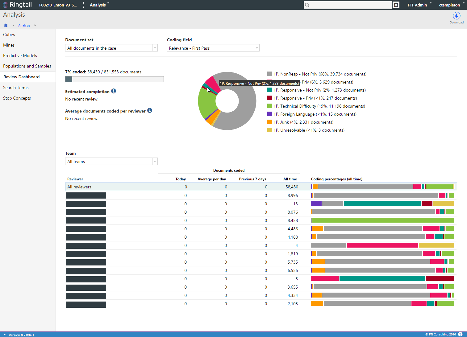
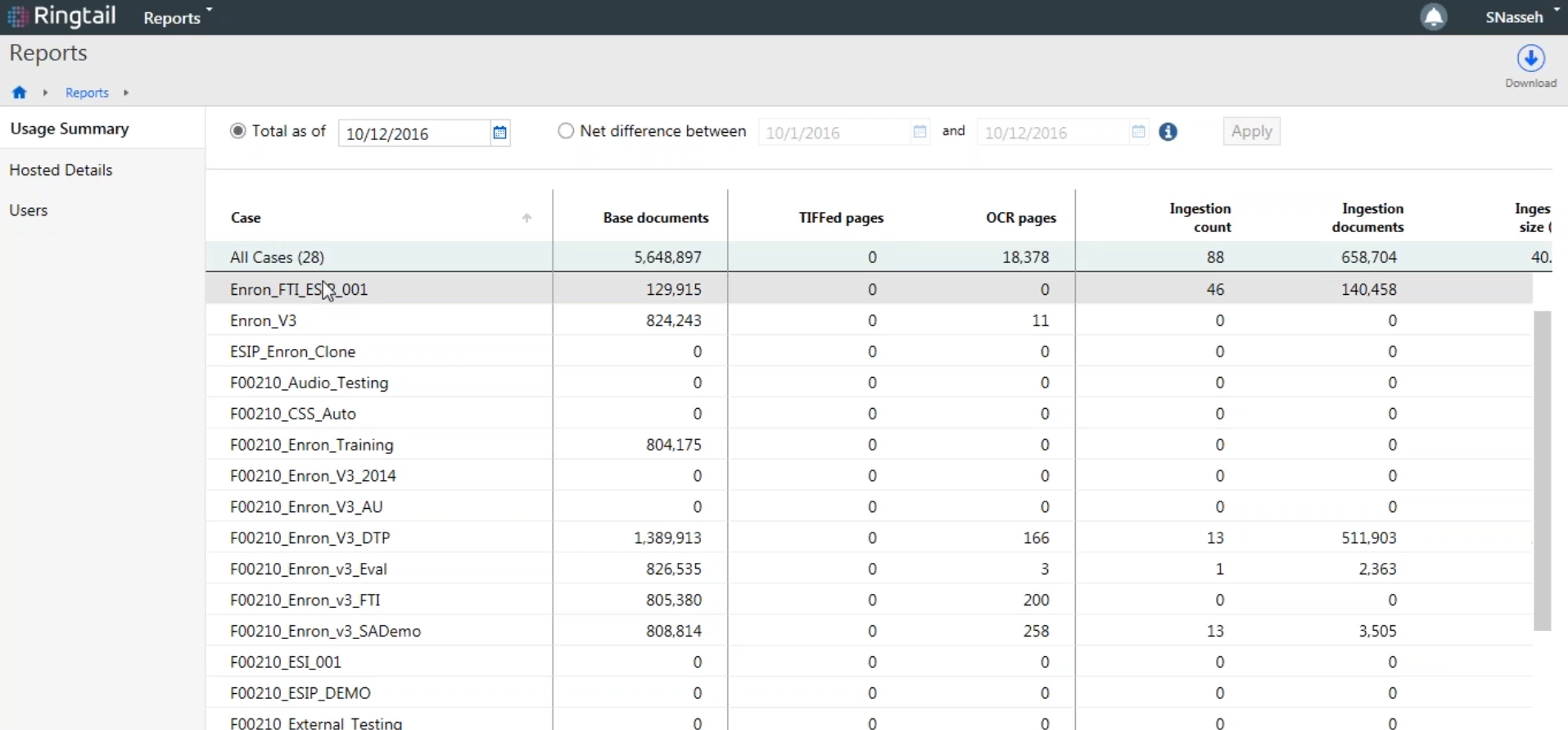
The Review Dashboard delivers high priority information, including an overview of project progress and breakdown of how the document set was coded, and information about each review attorney on the team and how they are coding documents in their assignments. Managers can compare coding from individual reviewers to the average to spot potential training problems or mistakes. The usage and hosting reports help users track valuable, timely information to manage their accounts.
Process
One of the challenges of this project was understanding the diverse needs of review managers, the primary intended users. In addition to reading industry reports and reviewing competitor features, I interviewed several representative users and talked with them about their current process.
I found that some users had IT support and were able to get custom reports, but many of the reports were inaccurate and difficult to use. I followed up with a survey to find out which of the currently available reports were most useful and needed most often. We worked with internal stakeholders to help determine project priorities and to get feedback throughout the design and development process.
I worked closely with a local development team and attended daily stand-ups and scrum meetings. By working together and talking through UI details, we uncovered potential problems and addressed them quickly. An example would be edge cases like having insufficient or stale for the dashboard, which lead us to specific visual treatments and messaging for users.
In addition to the dashboard for review managers, we also released reports for project administrators as part of the overall effort to bring more reporting into Ringtail. These reports help clients monitor their data usage and hosting, which affects their monthly billing.

For the Usage Summary and Hosted Details reports, some of the UI challenges included showing both the month and the running total amount for each item tracked, and the overall filtering layout and language. There are also many columns to show, which lead to the need for horizontal scrolling. Although a static first column in the reports would be ideal for helping users keep their context while scrolling, it posed some implementation concerns. Ultimately any difficulties with context are managed with the use of column groupings and the ability to customize which columns are shown.